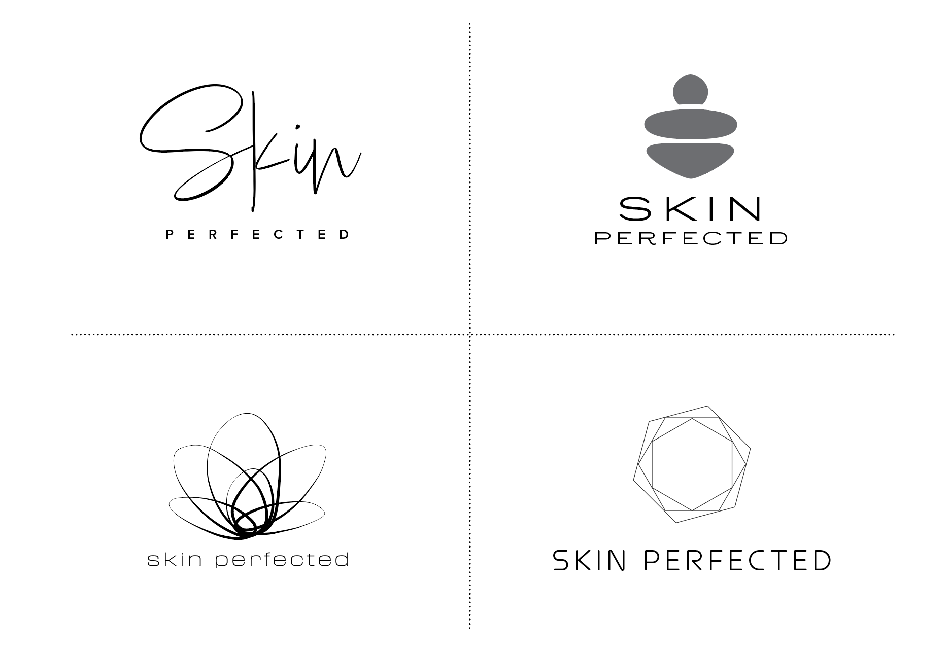
Since organic forms and human elements were a key focus area for developing the logo, I began with hand sketches. From there, I created three logos with icons and one word mark. Natural and organic forms were the main focus as the client stressed that they wanted something that was natural, approachable, and still looked like something that represented a luxury spa. I also played around with balancing precision and organic forms as they have a lot of experience under their belts and perform detailed procedures.
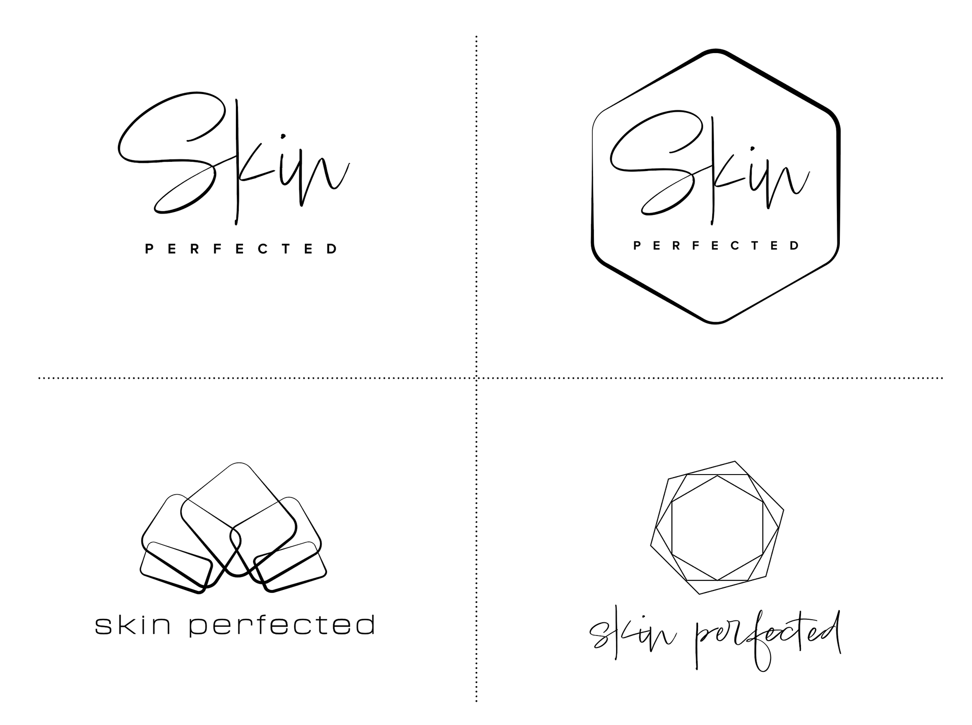
The clients were really drawn to the handwritten mark and handdrawn elements. The second round explored various weights and combinations of text to pair with the icons as well as cleaned up the script to ensure lines were smooth.
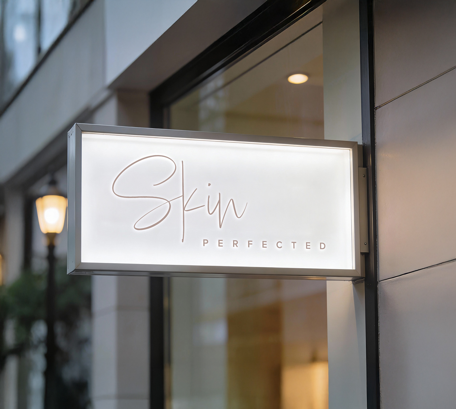
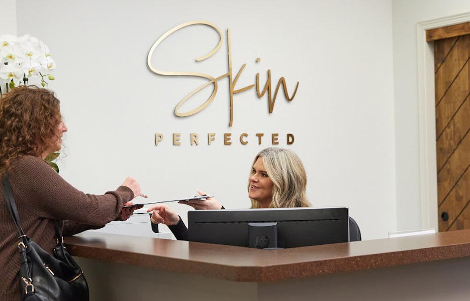
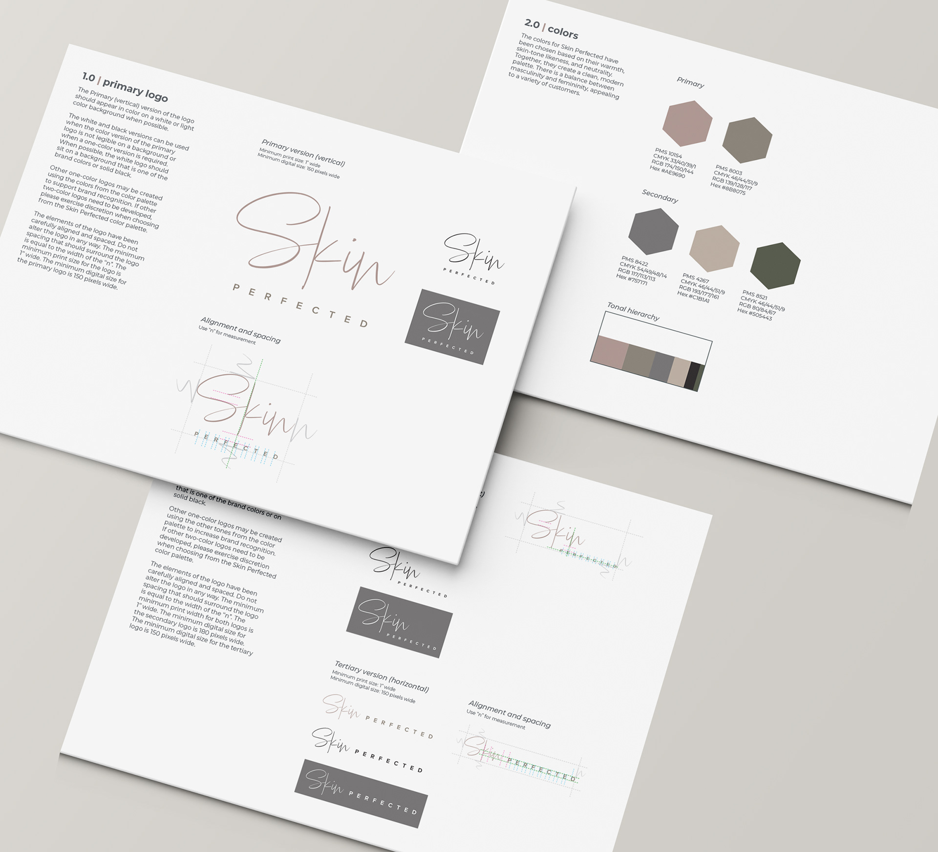
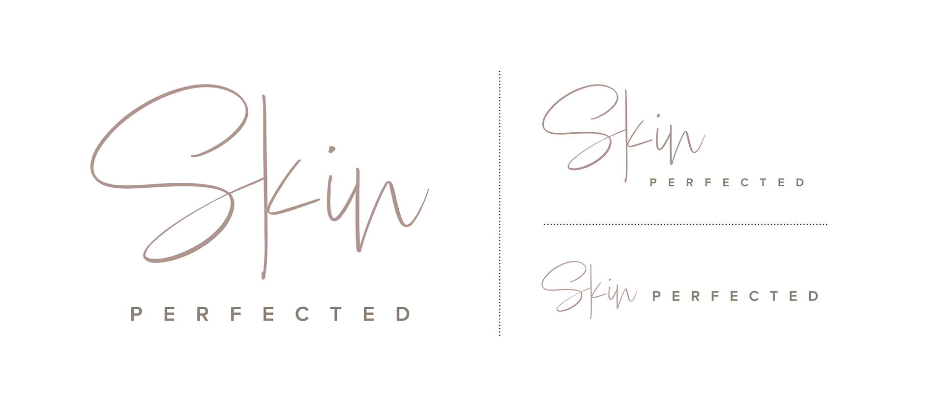
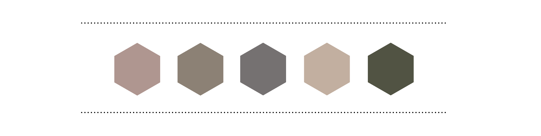
The final logo was a wordmark that could be used in three different orientations to allow for flexibility and brand consistency. I explored and crafted a color palette inspired by skin tones and earth tones. Finally, a brand guideline was assembled that detailed the specifications for the logo’s various orientations, color usage, and typography.
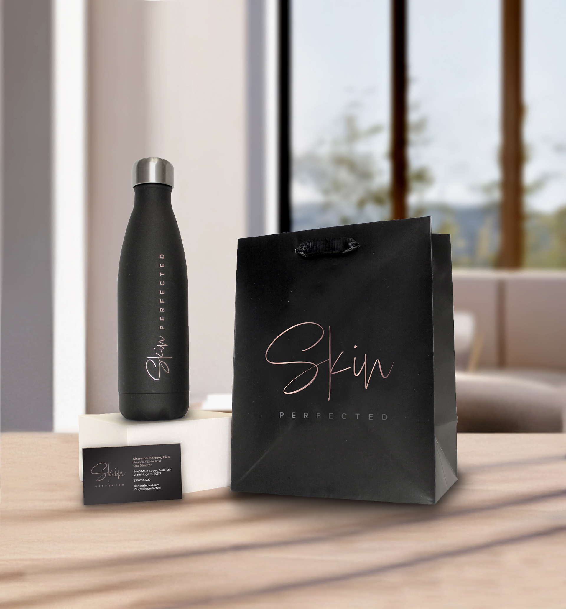
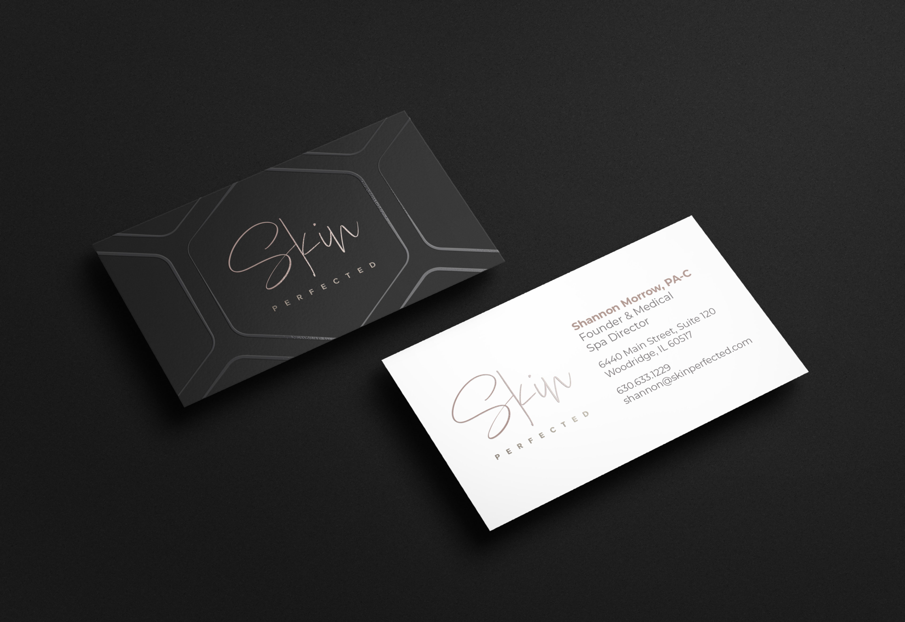
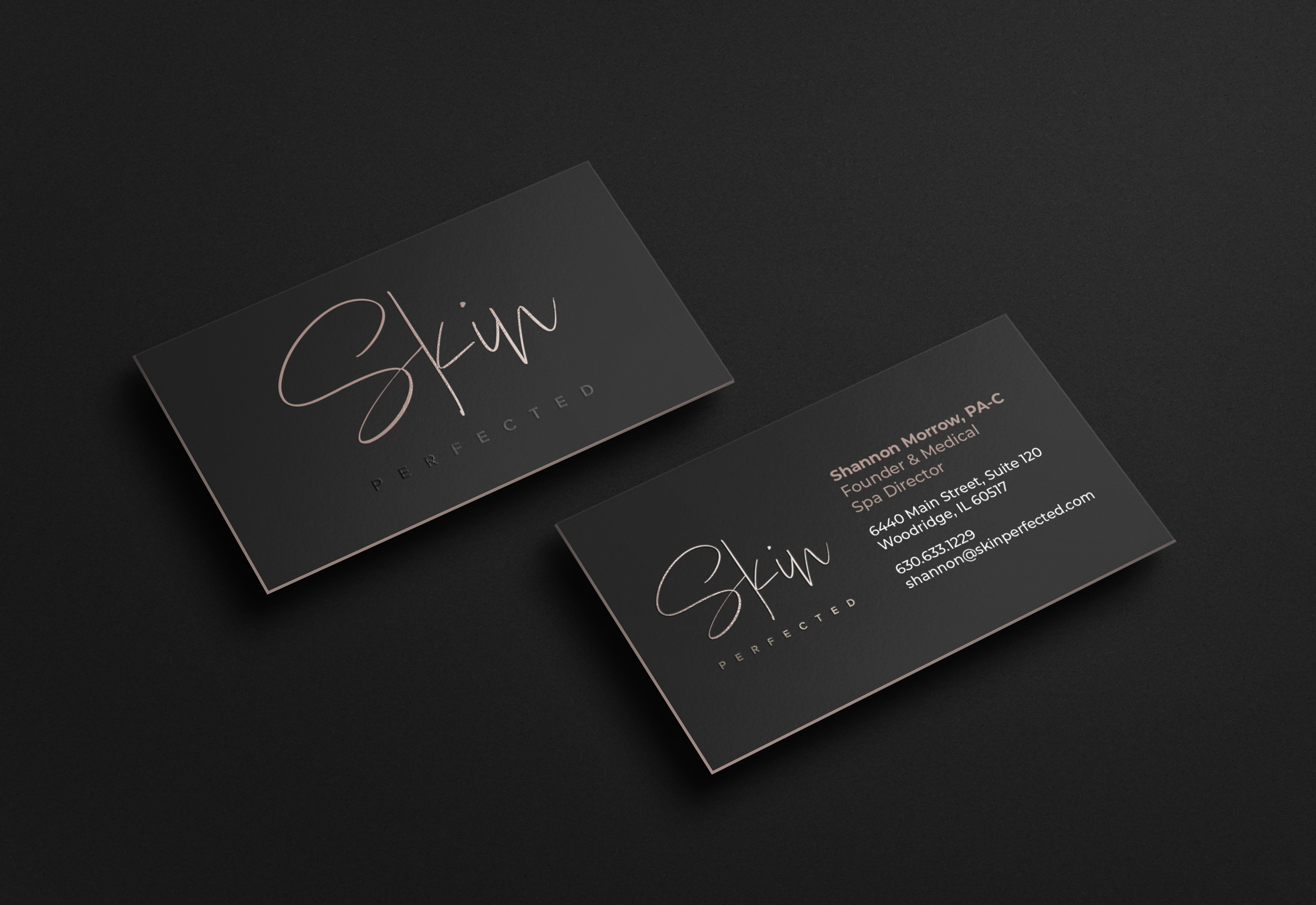
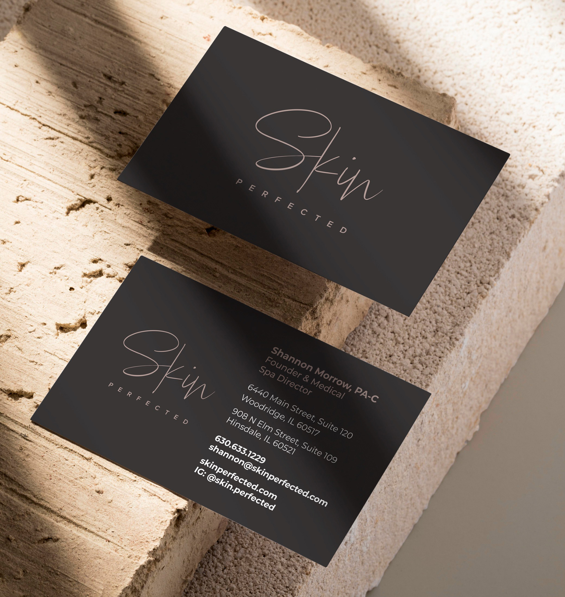
Once the logo was finalized, I moved onto creating business cards.
I continued to provide support to the client as they requested signage and premium items to give away to customers. While the Jak Premiums team sourced the products, I created mockups of the items, reviewed proofs, requested changes when needed, provided the art files needed for production, and did quality check when the items arrived at the office to ensure the client would receive exactly what they requested.