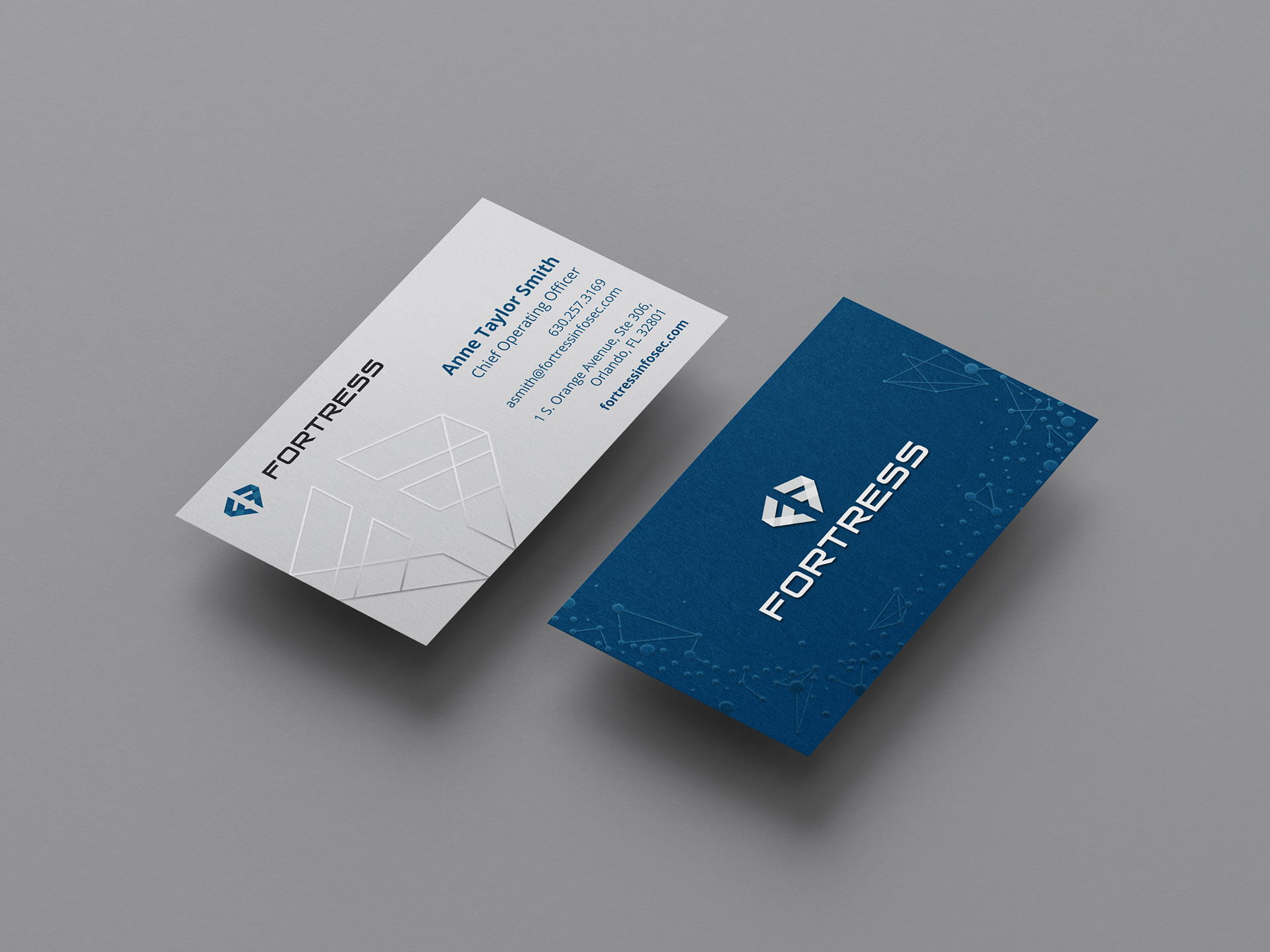
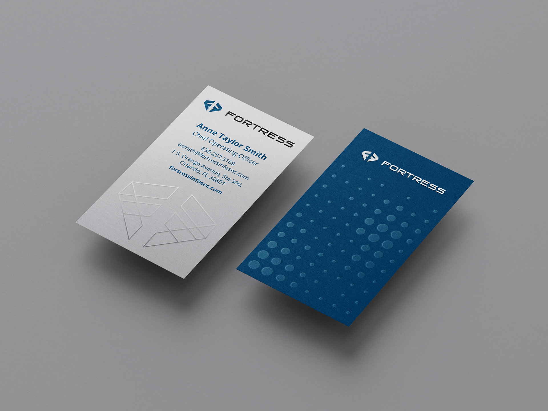
To start the business card design, I played around with the icon in their logo. The client expressed that they wanted their card to stand out via touch so, through some connections at Jak Creative, I learned from some print reps various techniques that could be utilized. Besides a heavier, uncoated paper stock, the team at Jak agreed that using a UV gloss varnish to emphasis the logo would create an interesting texture. Two of the first options that were presented feature blind UV gloss on the icon on both sides of the card, and the last had the icon printed in a gray that wold then be coated with a gloss for extra visual weight.
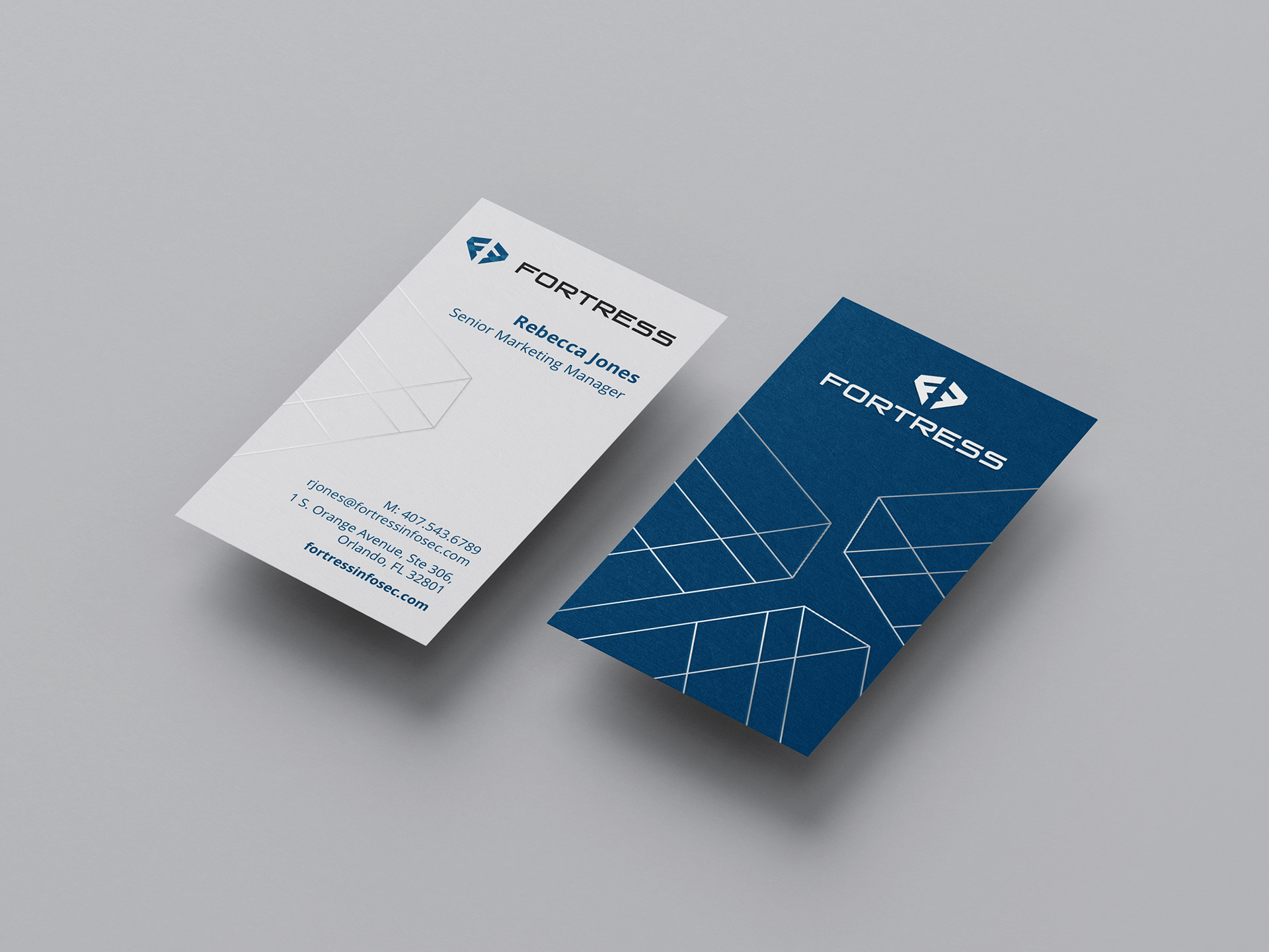
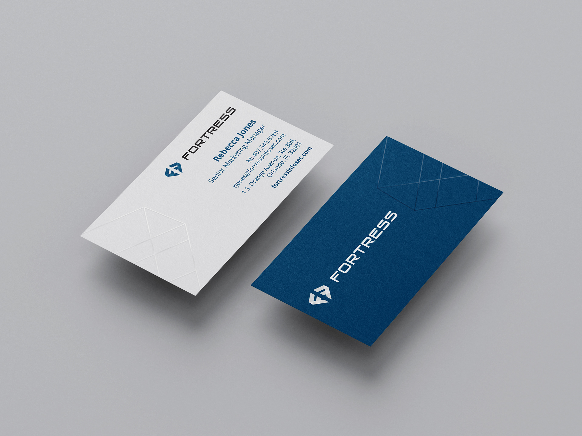

In the second round, the client wanted to explore creating texture with patterns and make the icon a bit more prominent but still subtle. I added a gray icon to the front that would be coated with UV gloss and presented three options for the back that were based on abstracting the ideas of data, connecting points, and cybersecurity infrastructure.
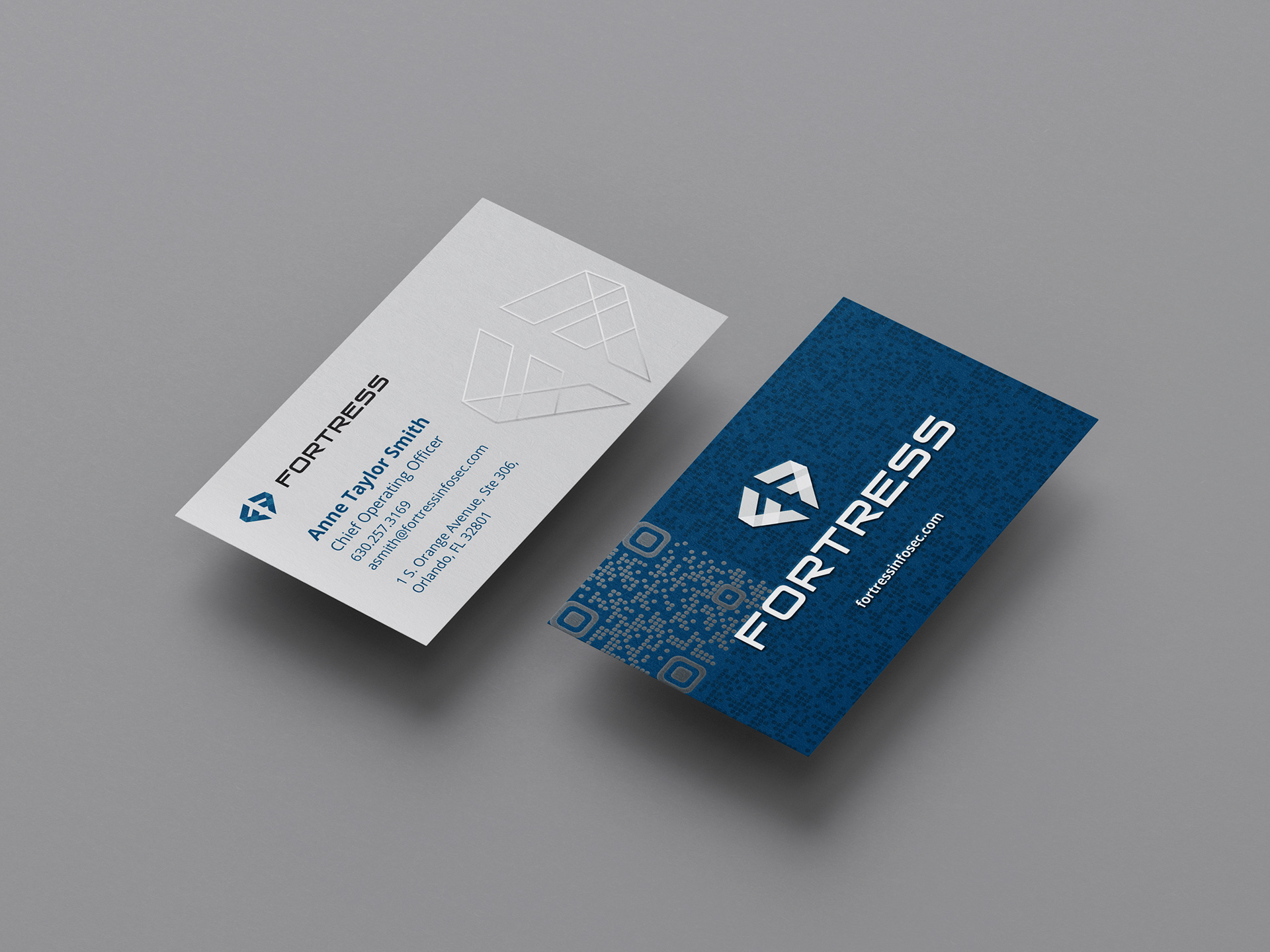
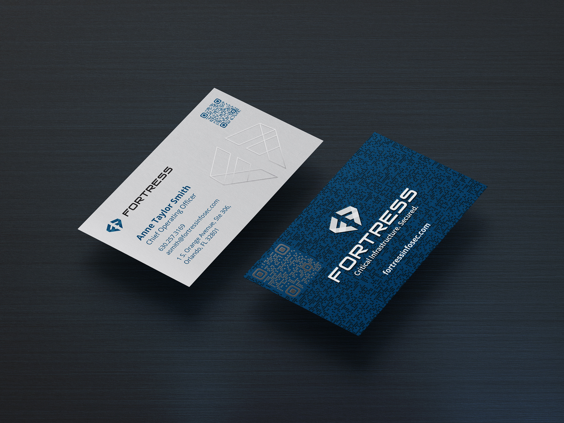
The front of the final business card featured a QR code on the front that lead to the owner's calendar. It also had a light symbol that had a spot gloss coating to add some texture. The back design featured the "data dots" design and a QR code that lead to the main website.