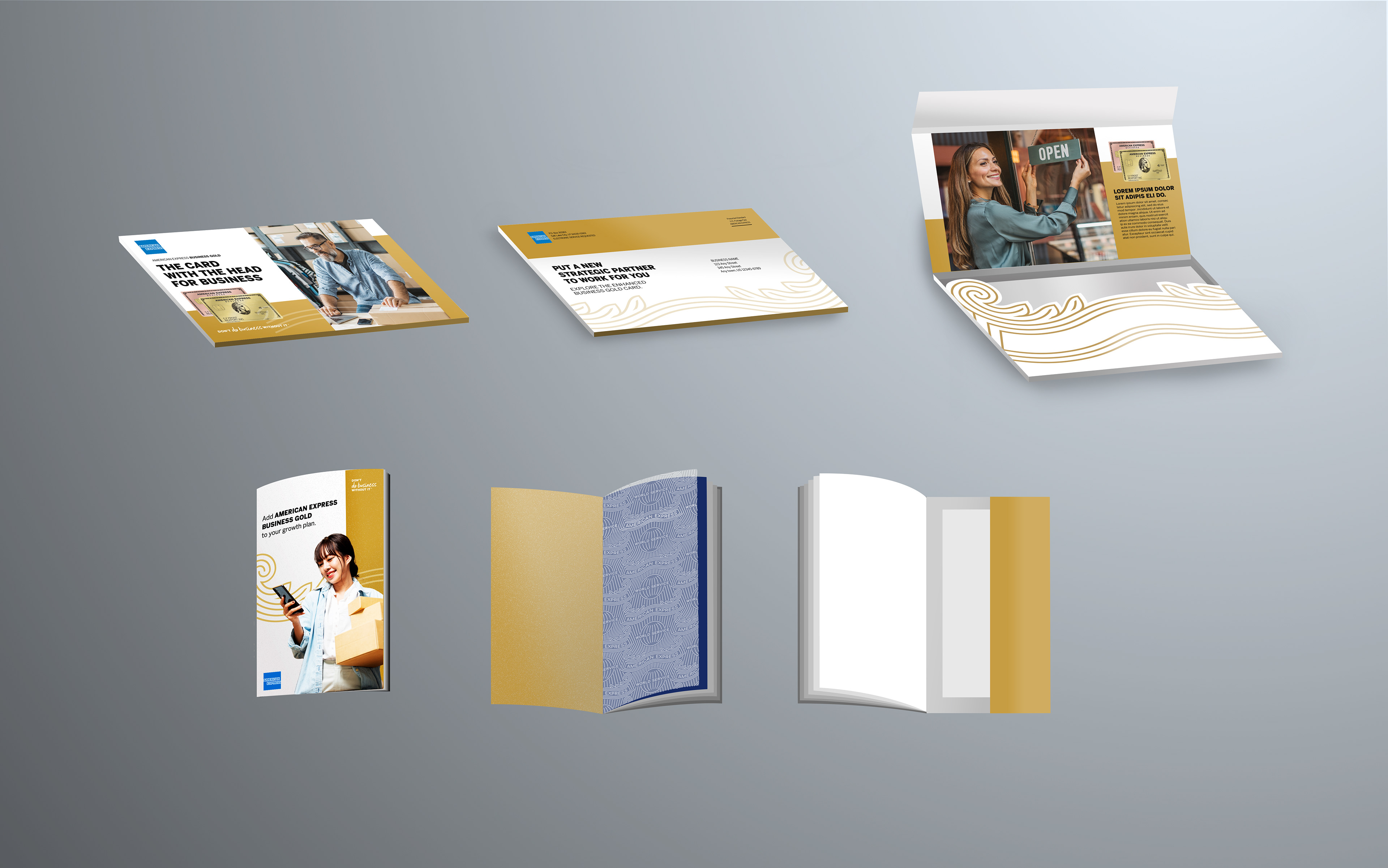
The first option for the packaged featured a die cut that fit around the flourish, one of the brand assets for American Express. The brochure would use velum pages to lay over images and would have a pocket in the back for additional inserts.
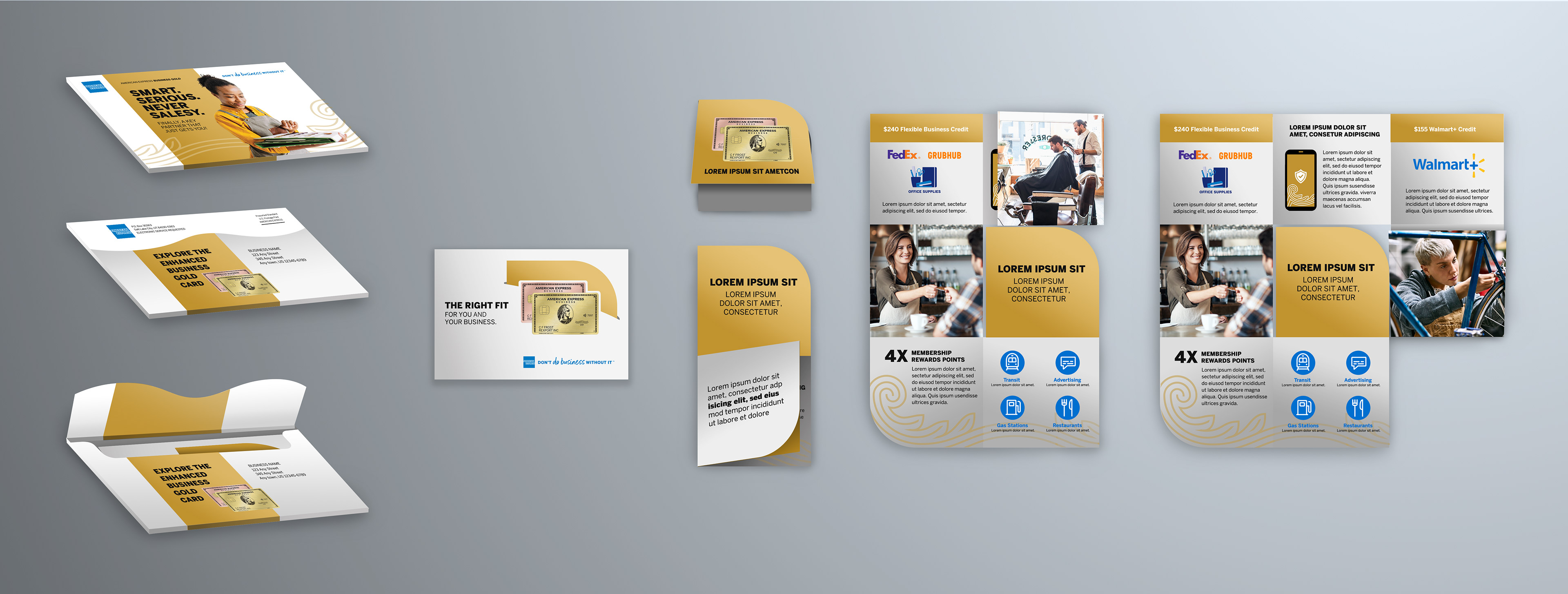
The second option utilized a curved flap on the outer envelope that mimicked the shape of the American Express ribbon. The snake fold brochure would tuck inside a card and, when opened, would reveal the enhanced benefits and features of the Business Gold Card while highlighting new images.
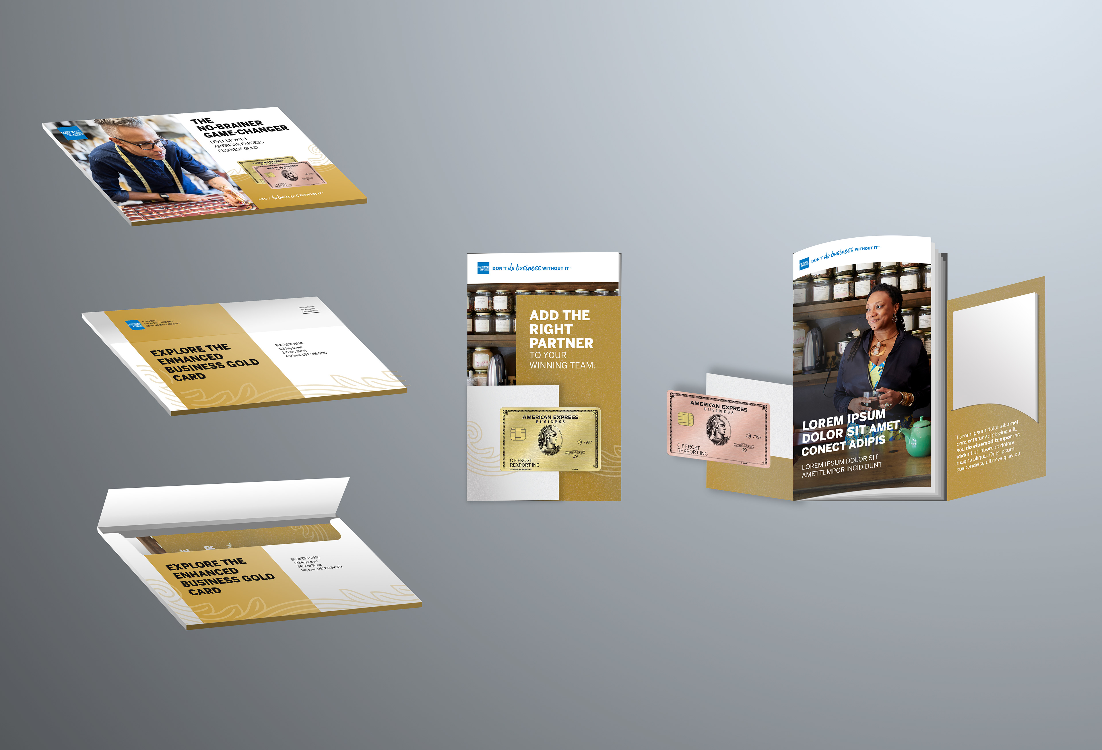
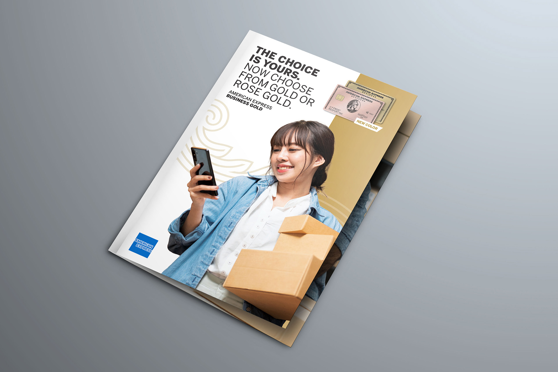
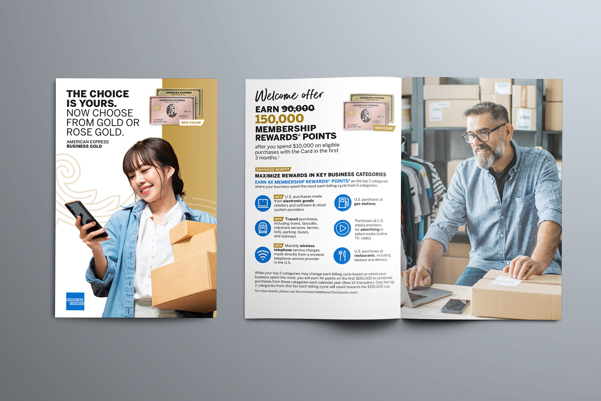
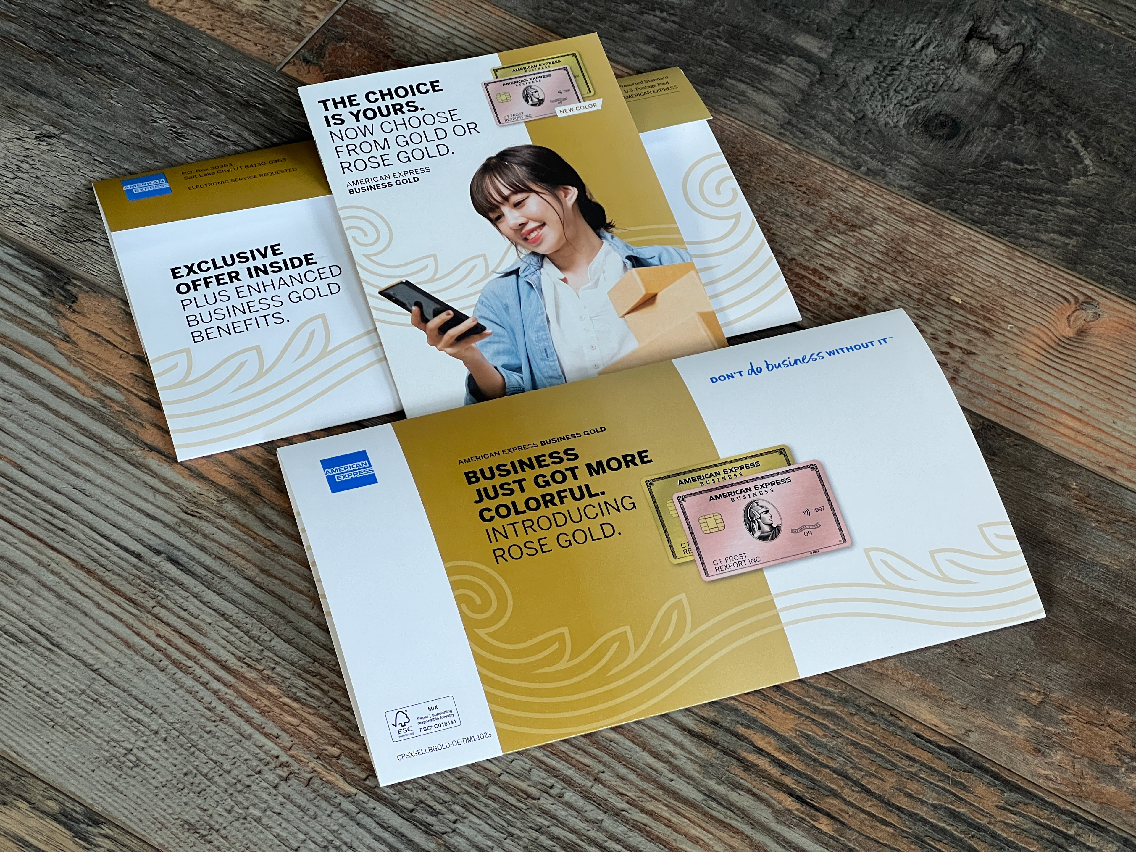
The outer envelope in the third option was more straightforward, but the brochure would have two panels that would fold around the front to create depth and interaction. The front panel would showcase the option to choose either a gold or rose gold card, and the second panel would have a pocket to contain the other inserts for the mailer.
As the deadline for the project drew closer and the production team became more involved, it was discovered that there would be an issue with the flourish dieline on the inside of the mailer. We immediately began brainstorming how we could still save the dieline, as it was a feature of the mailer that greatly impressed the product team. The production team had communicated the problem to us, and we were able to figure out how the art could be adjusted to satisfy everyone. By shifting the art up and increasing the safe area around the edge of the art, the full pocket that was needed by production could be created and the overall die line would still fit to the shape of the flourish.
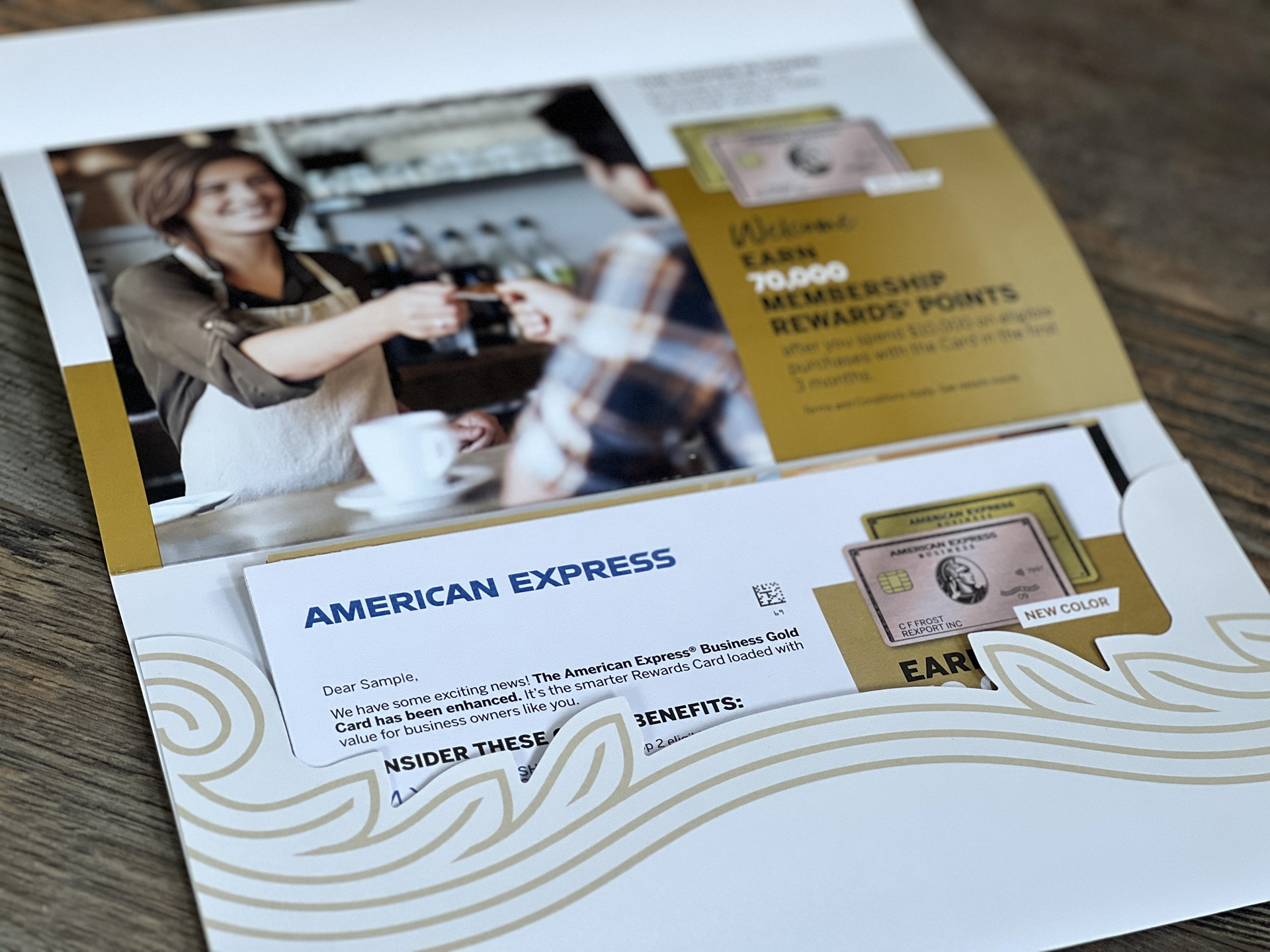
In the end, the size of the mailer along with the textured pearlescent varnish made it stand out from the everyday mail. The receiver was immediately met with the new branding, which was further highlighted by the imagery, unique die line in the envelope, and layout of the brochure.